Purple is the new Red -- till Red's the new Purple
Be it grading or marking up a proposal or paper of mine or a colleague, I use red or green (now just red since my green is empty). I can read it since it stands out from the black or blue. It makes fixing the mistake easier than if I or the recipient use a black or blue pen or pencil.
But Joanne Jacobs tells me that I'm not hip and withit.
Purple is the new red.
Red is politically (if not fashionably) incorrect. It has historically meant "wrong." (Duh!) We must therefore use purple to highlight students'... innovative use of commas, math errors, spelling, etc. This is clearly seen on the link above where you see a photo of "purple" (otherwise known as dark blue under low light) marking up a 1rst grader or a meteorology professor's penmanship homework (Since that chickenscratch is getting a bunch of the new F's, it just could be mine).
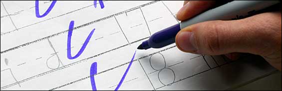
Eyup... I can read it. But it sure looks darn close to blue in my eyes -- which is why I like red (or red-green if your color blind). Likewise, green stands out. Red (and green) are just the only colors in the box that aren't taken by text or highlighting. (Grading map analyses are a different story, but anyway...)
I've only seen references not to use red when working with certain Asian cultures as red is used specifically to crucify the recipient (though I have never seen any proof of it since my Asian students don't seem to have issues with it). But otherwise I have never seen the directive. Then again, I'm old school, taught teaching by old school meteo profs who wanted us to see our mistakes so we could correct them. Consequently, I'm not hip to the jive – until purple gets the same historical connotation as red.
Sorry, I'm sticking to red. As long as the designated color or text is black and blue (the same as a bruise or properly “cooked” Pittsburg steak), I'm gonna make their eyes bleed.
Fair’s fair...
But Joanne Jacobs tells me that I'm not hip and withit.
Purple is the new red.
Red is politically (if not fashionably) incorrect. It has historically meant "wrong." (Duh!) We must therefore use purple to highlight students'... innovative use of commas, math errors, spelling, etc. This is clearly seen on the link above where you see a photo of "purple" (otherwise known as dark blue under low light) marking up a 1rst grader or a meteorology professor's penmanship homework (Since that chickenscratch is getting a bunch of the new F's, it just could be mine).
Eyup... I can read it. But it sure looks darn close to blue in my eyes -- which is why I like red (or red-green if your color blind). Likewise, green stands out. Red (and green) are just the only colors in the box that aren't taken by text or highlighting. (Grading map analyses are a different story, but anyway...)
I've only seen references not to use red when working with certain Asian cultures as red is used specifically to crucify the recipient (though I have never seen any proof of it since my Asian students don't seem to have issues with it). But otherwise I have never seen the directive. Then again, I'm old school, taught teaching by old school meteo profs who wanted us to see our mistakes so we could correct them. Consequently, I'm not hip to the jive – until purple gets the same historical connotation as red.
Sorry, I'm sticking to red. As long as the designated color or text is black and blue (the same as a bruise or properly “cooked” Pittsburg steak), I'm gonna make their eyes bleed.
Fair’s fair...
posted by Bill @ 00:04
![]()

<< Home